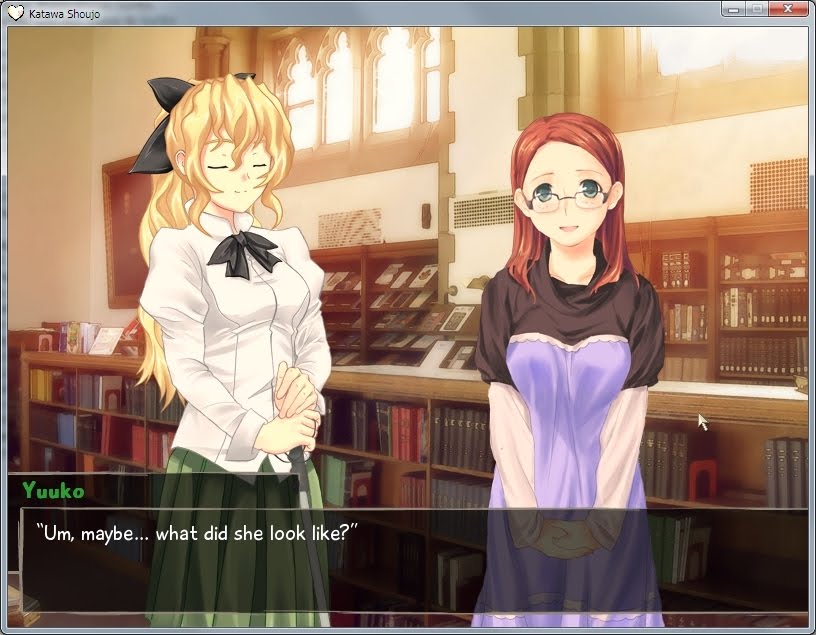
So, that new Yuuko.
- kosherbacon
- Posts: 902
- Joined: Fri Dec 04, 2009 7:30 pm
- Location: San Jose, CA, USA
Re: So, that new Yuuko.
Yuuko really looked just fine as she was. Maybe there's an ulterior motive for the extra attention, perhaps she'll play a bigger part in the full story than we anticipated? I don't mean like a path but maybe some Yuukosex?
-
cheesegrater3
- Posts: 24
- Joined: Sat Jul 18, 2009 4:54 pm
Re: So, that new Yuuko.
Ok, I am HATING the new Yuuko....So much....
I loved the old Yuuko, but this one....I mean look at that hair! And are those freckles?
OH! Now I know why I hate it so much. She now looks kinda like a ginger....
....I'm sad now.....
I loved the old Yuuko, but this one....I mean look at that hair! And are those freckles?
OH! Now I know why I hate it so much. She now looks kinda like a ginger....
....I'm sad now.....
Re: So, that new Yuuko.
Er, she always had freckles, just not on her sprite.cheesegrater3 wrote:I loved the old Yuuko, but this one....I mean look at that hair! And are those freckles?
Now that I take a look at it, the old sprite really did need to be upgraded. The arms, neck, mouth, shirt, and even hair all seem a little off. For comparison:

-
-abscess
Re: So, that new Yuuko.
Ok, time for the completely stupid question that, whether you like it or not, would pop up some time sooner or later:
What will hapen to Yuukoplant? This new Yuuko totally doesn't fit the Yuukoplant we all know and..... love?
The same applies to the Yuuko dakumakura, now that I think about it...
What will hapen to Yuukoplant? This new Yuuko totally doesn't fit the Yuukoplant we all know and..... love?
The same applies to the Yuuko dakumakura, now that I think about it...
Re: So, that new Yuuko.
Ok i'm just going to say it. I don't like the sprite upgrade. It just doesn't fit for some reason.
- Shades of Grey
- Posts: 118
- Joined: Wed Oct 14, 2009 3:02 am
Re: So, that new Yuuko.
Oh my, another sprite change. This time the change is much more drastic though.
Her new look is definitely much more detailed than her old one, which I think was a tad substandard quality wise. She has a bit more of a homely look and is a bit older too, both of which suit her. As a separate entity, the new sprites look great, however... they do not look like yuuko any more. The new sprites are not just an upgrade, but an overhaul of the character design as a whole. While the new look is undeniably better, the change is jarring for those who have become accustomed to old yuuko.
The new hairstyle shows a lot of forehead now ... I guess i don't mind that too much. One thing that kind of bugs me is that her library outfit is very casual. Its not a bad outfit in and of itself, but it seems unprofessional. Not the kind of thing suited for a staff member, especially not for a school that has its students in uniforms. Maybe I'm just nitpicky though.
I guess I am for it overall. I cannot deny that it looks better, but it will take some getting used to.
Light and Dark
Good and Evil
Right and Wrong
taken from afar they blend together
and the world appears
all in shades of grey
Good and Evil
Right and Wrong
taken from afar they blend together
and the world appears
all in shades of grey
Re: So, that new Yuuko.
Something tells me a Yuukoplant 2.0 will show up sooner or later. As for the dakimakura, maybe it's just her younger? People do tend to experiment a lot their freshman year of college, after all.-abscess wrote:Ok, time for the completely stupid question that, whether you like it or not, would pop up some time sooner or later:
What will hapen to Yuukoplant? This new Yuuko totally doesn't fit the Yuukoplant we all know and..... love?
The same applies to the Yuuko dakumakura, now that I think about it...
Although, the new Yuuko does seem to lend herself a bit more to naughty fanart... *taps foot impatiently*
Re: So, that new Yuuko.
Freckled Yuuko is most superior Yuuko
-
Mikage-sama
- Posts: 125
- Joined: Sun Dec 06, 2009 2:12 pm
Re: So, that new Yuuko.
I don't like the new Yuuko D: I want old Yuuko back! ;-; please?
-
-abscess
Re: So, that new Yuuko.
That is very, very true. Most people don't seem to dig the librarian outfit but... c'mon! It sticks to the right places and the fabric seems so light, so.... fine and thin that it seems it could be easily torn apart with just a finger! It's marvelous!Csihar wrote:Although, the new Yuuko does seem to lend herself a bit more to naughty fanart... *taps foot impatiently*
.......
*ahem*
I uh.... have to go... do.... something
Re: So, that new Yuuko.
I honestly hate this new sprite. It's not just the dress (which is ugly), but the hair and face as well. It's just an awful, boring, lazy hairstyle; I hate how she has her hair tucked behind her mouse ears. It even looks greasy, like she hasn't showered. Her eyes are tilted too much and look "sad." Glasses have an identity crisis, like they're supposed to be both hipster (thick arms) and classy (half-frameless). It's like Kamifish did his best to remove everything that made Yuuko genuinely cute and just tried to make her look like a geek with boobs.
Edit: Plus I think if the new Yuuko and the new Emi were put side-by-side their art styles wouldn't match at all.
Edit: Plus I think if the new Yuuko and the new Emi were put side-by-side their art styles wouldn't match at all.

- kosherbacon
- Posts: 902
- Joined: Fri Dec 04, 2009 7:30 pm
- Location: San Jose, CA, USA
Re: So, that new Yuuko.
Well played, Pimmy.
Although, she does look nicer in that picture you just posted than in the new sprites.
Although, she does look nicer in that picture you just posted than in the new sprites.
Re: So, that new Yuuko.
Caesius wrote:I honestly hate this new sprite. It's not just the dress (which is ugly), but the hair and face as well. It's just an awful, boring, lazy hairstyle; I hate how she has her hair tucked behind her mouse ears. It even looks greasy, like she hasn't showered. Her eyes are tilted too much and look "sad." Glasses have an identity crisis, like they're supposed to be both hipster (thick arms) and classy (half-frameless). It's like Kamifish did his best to remove everything that made Yuuko genuinely cute and just tried to make her look like a geek with boobs.
Edit: Plus I think if the new Yuuko and the new Emi were put side-by-side their art styles wouldn't match at all.

She kinda looks like Willow from the early seasons of Buffy when she was still a nerd. But Willow with glasses. I'm sold.
Re: So, that new Yuuko.
I get the feeling that my opinion doesn't really mean anything if it's not positive. 


