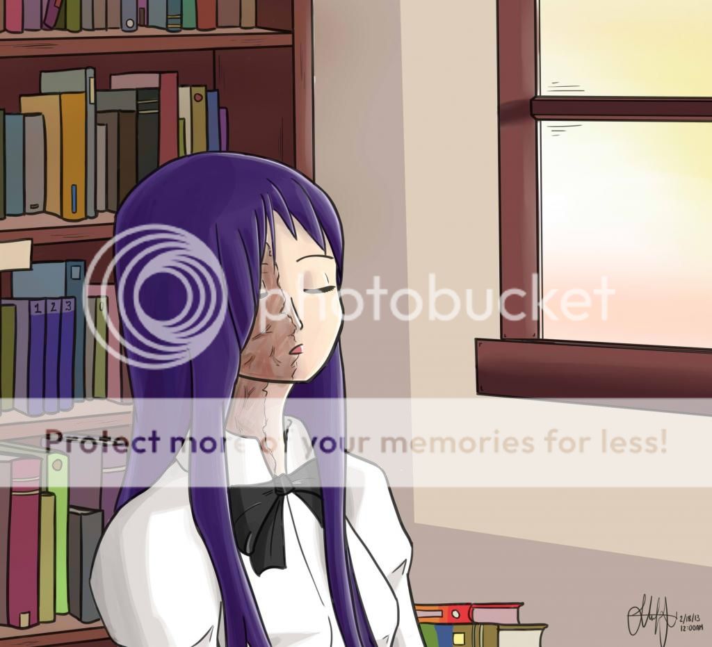
I'd love any critiques. I used a new shading technique for her hair, so it kinda looks strange. This is also my first time posting on this forum! Hanako path is my favorite after Lily.
Looking forward to contributing more fan arts.

Thanks for the reply! Mhm you're right. I wanted to angle her chin up a bit, but it ended up stretching her face instead.StudyOfWumbology wrote:Looks nice and cartoony. I have noticed two things:Her head is a little too thick and her scars aren't that severe, so maybe lighten them a little?
I'm afraid i don't follow.Keppay wrote:Thanks for the reply! Mhm you're right. I wanted to angle her chin up a bit, but it ended up stretching her face instead.
In this drawing I wanted to somewhat amplify her scars because I feel like that's what defines Hanako for me.
I've been trying to improve from the cartoony style but it's a slow process. I think I need to review the color palette, because my shading is weak and give off that flat look you've commented. I've followed a tutorial where it suggested to go for a color cooler than the base color for shading, but I think I should have gone for even darker color for the shade.Dream wrote:Don't know if you were going for a cartoony style but it does give that feel. Values are kinda flat and could benefit from being more varied/interesting, at least in the face and hair. While her scars are probably different in the VN (less severe) i have a hunch that is the kind of stuff that falls a lot on artistic license when it comes to fan-art so i can't really say i find it "wrong" and to tell you the truth i kinda like it.
I'm using PaintTool SAI and I can never seem to get that varying pen thickness you get with actual pen and paper. When I use different pen sizes, the linework doesn't become clean. It would be nice if you could give me quick tips how to elaborate the linework.Dream wrote:There are probably some perspective issues regarding the books and the shelves, but i'm not entirely sure of that. By the way, your linework is really nice/clean, but it could probably benefit from being more elaborated or varied regarding weight, then again you probably intended to go for an even, cartoony style.
Good drawing, man. Her face is surprisingly expressive.
I didn't do so well with her anatomy. Her neck was positioned too far behind her head and that gave her a stretched face. And I wanted to amplify her burn scars as part of artistic license.Dream wrote:I'm afraid i don't follow.Keppay wrote:Thanks for the reply! Mhm you're right. I wanted to angle her chin up a bit, but it ended up stretching her face instead.
In this drawing I wanted to somewhat amplify her scars because I feel like that's what defines Hanako for me.