Page 1 of 1
Yet Another Fanart Thread
Posted: Thu Jul 30, 2009 3:04 am
by AlhambraIV
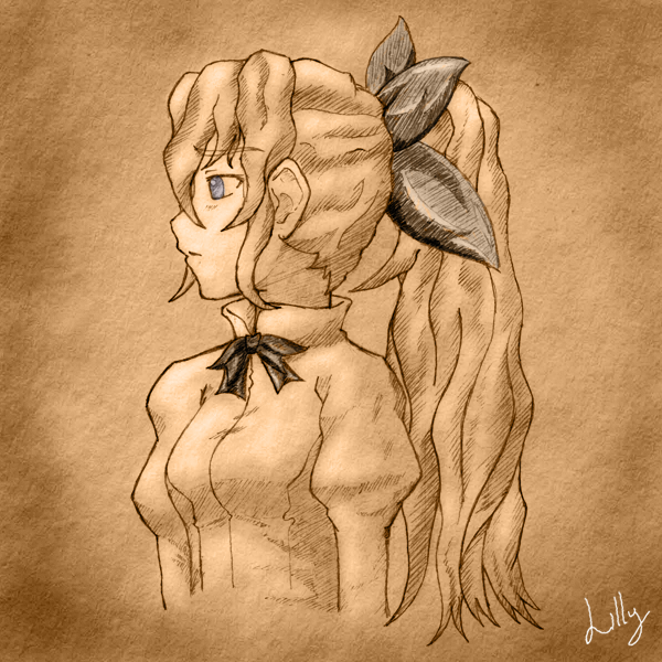
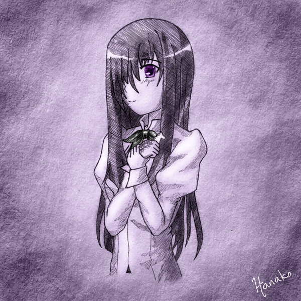
It's as the title says. I started these sketches ages ago, but only recently got around to finishing them. Having nothing better to do, I'm'a postin' them here.


...and now back to lurking. >_>
Re: Yet Another Fanart Thread
Posted: Thu Jul 30, 2009 3:18 am
by Duo2Cuo
They are really very good, especially the Lilly one.
I like the tan/yellow shading, it gives a relaxed feel.
Re: Yet Another Fanart Thread
Posted: Thu Jul 30, 2009 4:59 am
by carbonartistmonked
lilly looks fine

i don't recall
but was her hair that long?
the long hair you draw was a plus point to me
i love gals with long hair

but i've got a few problems with hanako though
 the face... the proportions are wrong
her lip should be placed lower
and more to the right
arms too small
Re: Yet Another Fanart Thread
Posted: Thu Jul 30, 2009 4:00 pm
by Ozymil
Other than the problems with proportion that carbon brought up, these were great. Love your style, hope you do more!
Lovin' the somber Lilly.
Re: Yet Another Fanart Thread
Posted: Thu Jul 30, 2009 4:18 pm
by AlhambraIV
Yeah, the arms thing is what bothered me most about the Hanako sketch.
I have other sketch ideas. I just need to, uh, draw more often. ...My average is usually about three pictures a year. v_v
Re: Yet Another Fanart Thread
Posted: Thu Jul 30, 2009 7:10 pm
by Bara
The color choices you made for the pic of Lilly give it a classic feel. I suppose its the sort of "aged paper" look that my mind interprets as, "It has to be a classic if it is old.". The absurd connections that the mind can make just from the colors used.

Re: Yet Another Fanart Thread
Posted: Thu Jul 30, 2009 10:21 pm
by powell
i came
nuf said
Re: Yet Another Fanart Thread
Posted: Thu Jul 30, 2009 11:17 pm
by Vertical
Your username is Alhambra, therefore I will love and approve of everything you do without question.
Lilly's leaves nothing to criticize, Hanako's proportions and hands appear off, but you went with an interesting style and texture. Like rough paper, or stone wall even.
