Ohceedward's Gallery (Updated as of 08/13)
- ohceedward
- Posts: 11
- Joined: Thu May 09, 2013 5:40 am
- Contact:
Ohceedward's Gallery (Updated as of 08/13)
HELLO. WELCOME.
..that came off as creepy, sorry.
*cough*
Anyway, the right side of my brain's working real hard these past few weeks. I will just post some random projects I've been working (and thinking) on (and thinking of doing). Here's a liiiiiiiiiittle list of some fanfiction I'm currently busy with.
ProfAllister's Misha Route: http://ks.renai.us/viewtopic.php?f=52&t=7140
Currently working on a manga for this. Still stuck at the flashbacks. I'm kind of having troubles with backgrounds so.. expect little from my perspective skills. D:
Thanatos02's Akira Pseudo Route: http://ks.renai.us/viewtopic.php?f=52&t=7113
Will occasionally post a few scenes from this fic.
Posts will be seperated, I guess. Haha. Thanks for taking the time to view my little gallery.
Last edited by ohceedward on Tue Aug 13, 2013 9:40 am, edited 3 times in total.
WAHAHA!~
- ohceedward
- Posts: 11
- Joined: Thu May 09, 2013 5:40 am
- Contact:
Re: Ohceedward's gallery.
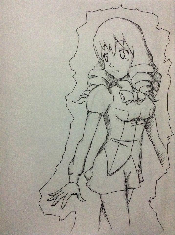
Here's a little teaser for the Misha Route.
Dedicated to Mike Inel's style. This might be the image for the title page. Will work on more ideas.
WAHAHA!~
Re: Ohceedward's gallery.
Well done!
"The way I see it, every life is a pile of good things and bad things. The good things don't always soften the bad things. But vice versa, the bad things don't necessarily spoil the good things or make them unimportant." ~ The Doctor.
Re: Ohceedward's gallery.
Don't want to be a dick, but have you talked to either of the authors about your intent?
Really nice Misha, by the way.
"It is not reason, more or less furnished, but will that makes the world march"
"Unfortunately, if you can think of something really stupid, someone out there probably believes it." -Xanatos
- ohceedward
- Posts: 11
- Joined: Thu May 09, 2013 5:40 am
- Contact:
Re: Ohceedward's gallery.
I have yet to PM ProfAllister about it. I already mentioned in Thanatos's Akira Route about making fan art.Dream wrote:Don't want to be a dick, but have you talked to either of the authors about your intent?
Really nice Misha, by the way.
Ah, you're not being a penis, don't worry. I must admit I was enlightened by that. Thanks!
WAHAHA!~
-
- Posts: 509
- Joined: Sat Jun 16, 2012 12:49 pm
Re: Ohceedward's gallery.
I'll admit that I'm somewhat annoyed that I wasn't contacted, but not for the reason you might imagine. I'm annoyed that I had to wait to find out about this. A very minor, passing annoyance, though.
As for permission, no sooner asked than granted. My personal opinion toward control of my works reflects an interpretation of Nietzsche I once read: Nothing is forbidden. All is permitted. Now go and make something beautiful. (This only applies to the elements that are original to my work. Everything owned by 4LS still falls under their license, of course.)
As a matter of courtesy, I'd appreciate being credited for my role if feasible, but that's just good manners.
I like the picture, by the way. It may just be the perspective, but she seems to narrow quite a bit from the waist down. And, from a narrative significance point of view, I'm not sure what the image itself is supposed to convey (all of the original images of that sort had some special relevance to the given act).
Either way, it looks good, and I'm interested to see what develops.
- Walshy12238
- Posts: 117
- Joined: Sun Jul 01, 2012 2:58 am
- Location: Australia
Re: Ohceedward's gallery.
That's really good, I'll be interested to see what you come up with in terms of the manga. Hell, I want to see anything that you draw.
I wish I could draw.
Lilly > Hanako=Emi > Shizune > Rin
- ohceedward
- Posts: 11
- Joined: Thu May 09, 2013 5:40 am
- Contact:
Re: Ohceedward's gallery.
I do feel bad that I didn't contact you ASAP. My brain was too excited and the lack of internet during the time the idea came up crossed paths. Plus I wanted to surprise you.ProfAllister wrote:I'll admit that I'm somewhat annoyed that I wasn't contacted, but not for the reason you might imagine. I'm annoyed that I had to wait to find out about this. A very minor, passing annoyance, though.
As for permission, no sooner asked than granted. My personal opinion toward control of my works reflects an interpretation of Nietzsche I once read: Nothing is forbidden. All is permitted. Now go and make something beautiful. (This only applies to the elements that are original to my work. Everything owned by 4LS still falls under their license, of course.)
As a matter of courtesy, I'd appreciate being credited for my role if feasible, but that's just good manners.
I like the picture, by the way. It may just be the perspective, but she seems to narrow quite a bit from the waist down. And, from a narrative significance point of view, I'm not sure what the image itself is supposed to convey (all of the original images of that sort had some special relevance to the given act).
Either way, it looks good, and I'm interested to see what develops.
As part of the permission message (lol, PM), I did tell you that I will be crediting you as main author. I'm just here to provide some "hard copy" illustrations of your fic. I got a lot of free time *but I waste it on LoL or DotA2, sorry* and this fuels my hands to work on drafts.
Yeah, Misha does seem a little slim. It's not a permanent title page and I'm still trying to come up with ideas and drafts that would correctly convey whatever Act Name you decide for her.
Give me some time to refresh myself. I stopped drafting at page seven at the moment because.. life. Thanks for your feedback!
WAHAHA!~
- ohceedward
- Posts: 11
- Joined: Thu May 09, 2013 5:40 am
- Contact:
Re: Ohceedward's gallery.
Thank you, good sire. I just hope whatever I come up with is okay with you guys.Walshy12238 wrote:That's really good, I'll be interested to see what you come up with in terms of the manga. Hell, I want to see anything that you draw.
I wish I could draw.
And it's never too late to learn something new.
WAHAHA!~
- ohceedward
- Posts: 11
- Joined: Thu May 09, 2013 5:40 am
- Contact:
Teasers Section (08/13)
HEY GUYS. HERE ARE THE TEASERS.
Okay, I know they took a while. Sorry about that. Hard trying to find motivation since these are only.. well, teasers. I will continue the whole doujin once I see ProfAllister's done with the story itself (includes rewrites, proofreadings, and all the usual writing stuff).
So, here's a list to look out for:
> Manga style (read from RIGHT to LEFT)
> Colored fonts! (to eliminate space-consuming balloons, I decided to do this)
- Green: Hisao
- Pink : Misha
- Blue : Shizune (yes, she has one dialogue in this teaser)
- Fleshy: Emi
- Violet: Nurse (or Hanako, in future works)
- Brown: Mutou
> Round balloons indicate that characters aren't in the scene, while edged balloons indicate they're there.
> No shadings (I am very sorry about this)
> Kenji
> Again, COVER is not final.
OKAY! Covered that stuff. Time for the posts! I will need criticism so I can be this cold artist who fears nothing and will probably do his best even more.
Cover:
Okay, so it seems the link is broken. Sucks. Anyway, here's an alternate link to dA: http://ohceedward.deviantart.com/art/Fo ... -392914300
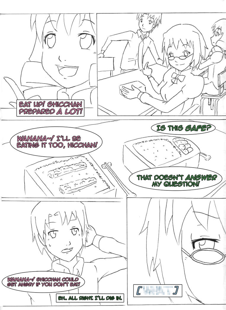
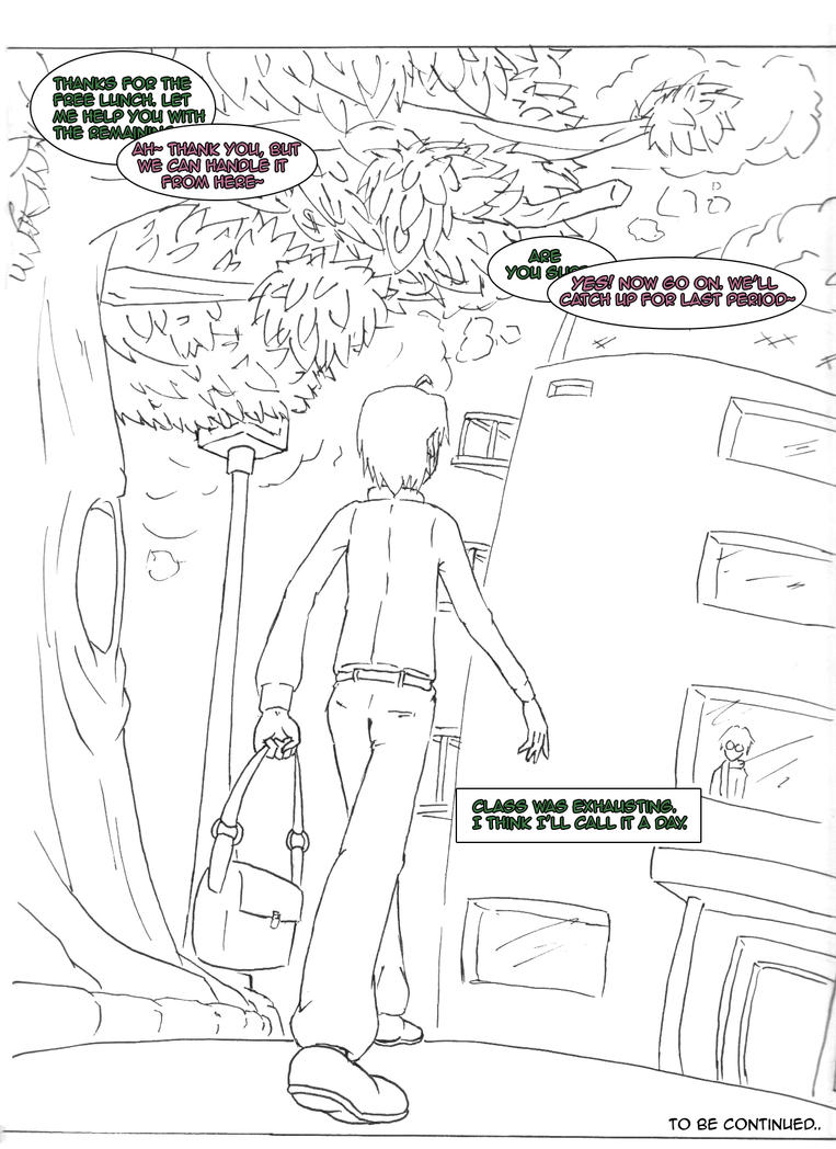
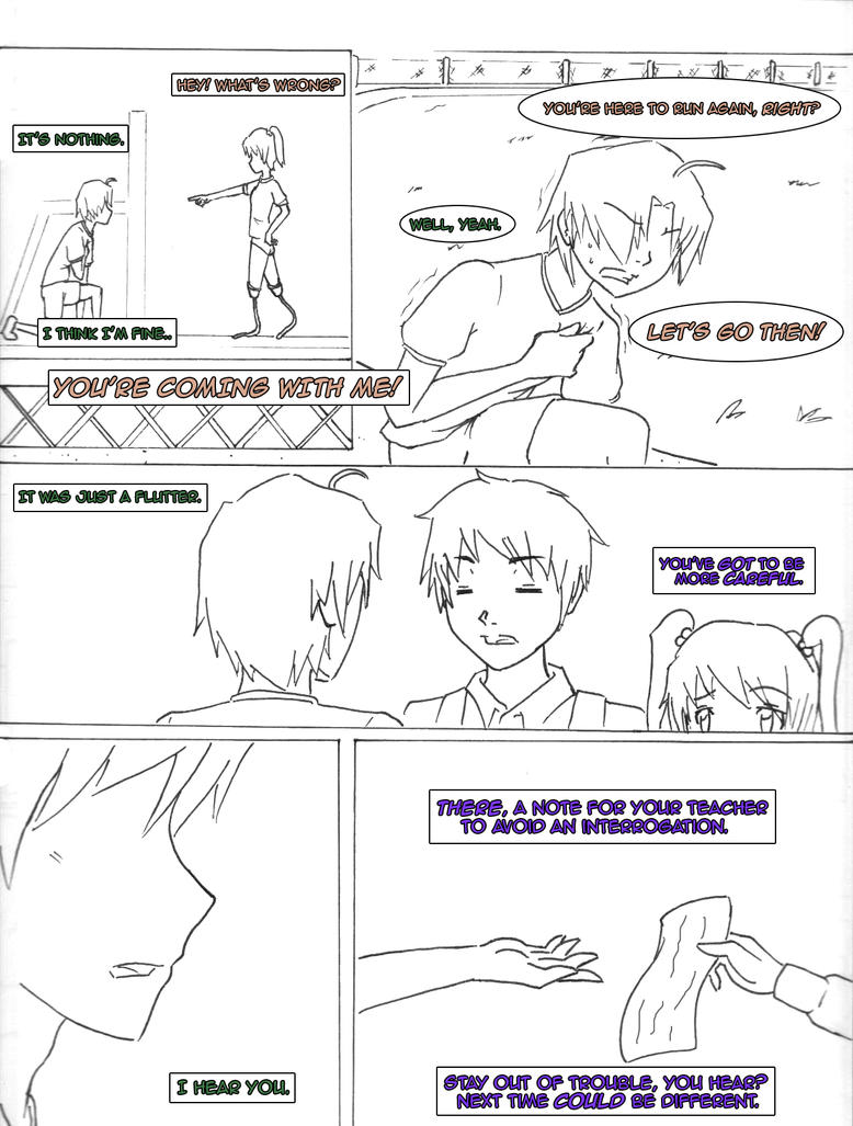
Page 01:
Page 02:
Page 03:
Page 04:
Page 05:
Page 06:
Page 07:
OKAY.
That concludes this section (or post). Gonna wait for the last words of the fic before I seriously get started. Again, criticisms are greatly appreciated. I may feel red so it isn't your fault. *whore
Last edited by ohceedward on Thu Aug 15, 2013 3:44 am, edited 3 times in total.
WAHAHA!~
- TheNicofabi
- Posts: 12
- Joined: Fri Aug 02, 2013 3:24 pm
- Location: Brandenburg an der Havel, Brandenburg, Germany
- Contact:
Re: Ohceedward's Gallery (Updated as of 08/13)
Wow... O.O i can totaly dig that fic. I am totaly amused by it. And... i dunno if its just for me but for me the cover is broken T.T...
It doesnt matter how a person looks like... it seriously is just important if you know that you feel for that person. When you think about that person and you find it weird... dont make it fade away, respect it and try your best in not loosing that person.
-
- Posts: 509
- Joined: Sat Jun 16, 2012 12:49 pm
Re: Ohceedward's Gallery (Updated as of 08/13)
Well, I didn't really express it in my last response, but I am flattered beyond words that you consider my fanfic worth the effort of taking on a project of this scale. It really is quite stunning.
As for the drawings themselves, they're quite good, if a little rough at certain points.
Some specifics:
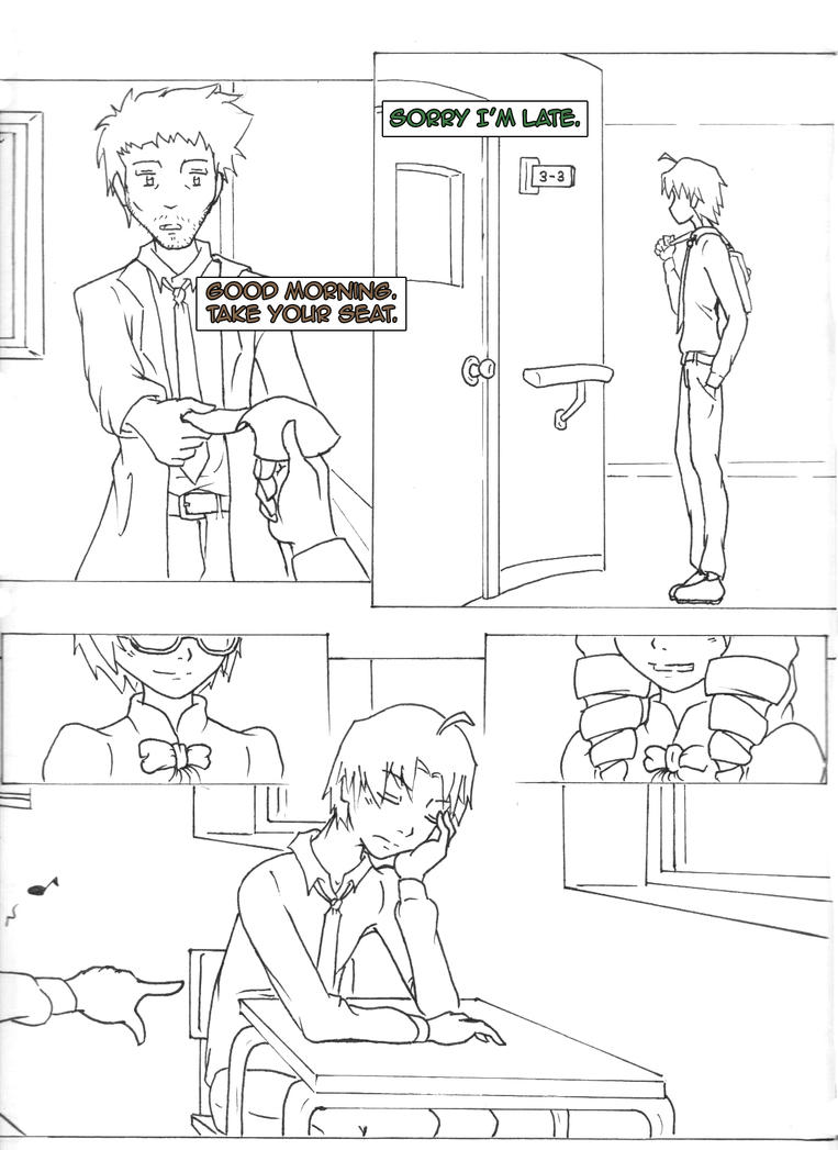
Page 2: Misha's smile looks a little more like a grimace. Also, I almost think it would make more sense for her to use her right hand.
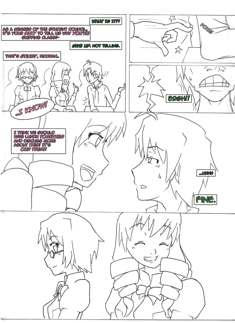
Page 3: The poke looks like it's hurting Misha, not Hisao. Poke someone (or yourself) for reference. The finger stays straight. It looks like Misha's breaking her finger.
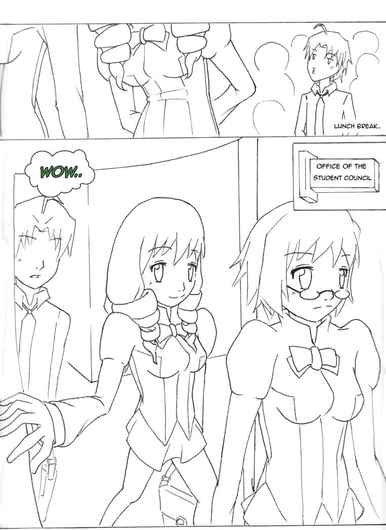
Page 4: Have to agree with Hisao on that bottom panel - wow. It looks like everything went all fisheye lens for a moment there. I'm guessing that's the sort of thing you were talking about with your "perspective skills" comment.
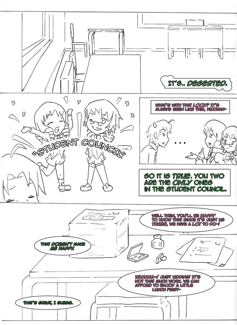
Page 5: The "Student Council" pose is cute. Can't really complain about this page. The foot fetishist in me can't help but point out that it looks like Shizune is wearing loafers rather than her iconic Mary Janes (with roses).
Page 6: More weirdness with perspective. The food shot seems to be fisheyed again.
Page 7: Mostly good, but things get weird with perspective again.
Overall, it's very good, but your vanishing points seem to be all over the place, which really messes with the perspective, giving certain shots an extremely surreal quality.
A little disappointed to hear that we won't see anything more until I finish writing (I guess that's supposed to be an incentive for me to speed up, huh? :p). No idea what your pace is, but you may want to consider getting on top of it sooner rather than later, since we're maybe as much as halfway through and my pace dropped dramatically after the new year rolled in, so the ending will (unfortunately) be more likely than not a long time coming.
As far as the possibility of rewrites, there's nothing planned at the moment. I may revisit the chapters once it's all done and archive old versions as I rewrite/clean up new ones, but that's looking very far down the road. I can guarantee that I have no intention of any sort of rewrites before I finish the first run. Also, on your deviantart page, you mention "bulky parts." Care to elaborate? I always welcome feedback, especially when it's suggestions on how I might improve.
Anyway, happy to know that my work has inspired you, and really looking forward to seeing more.
- ohceedward
- Posts: 11
- Joined: Thu May 09, 2013 5:40 am
- Contact:
Re: Ohceedward's Gallery (Updated as of 08/13)
Yeah, I noticed that too. I swear I checked the preview before posting it. It was there and who knows what happened to it. I'mma fix it right away. Thanks for the feedback!TheNicofabi wrote:Wow... YO.O i can totaly dig that fic. I am totaly amused by it. And... i dunno if its just for me but for me the cover is broken T.T...
WAHAHA!~
- ohceedward
- Posts: 11
- Joined: Thu May 09, 2013 5:40 am
- Contact:
Re: Ohceedward's Gallery (Updated as of 08/13)
Hah! Now that's what I'm talking about!ProfAllister wrote:Well, I didn't really express it in my last response, but I am flattered beyond words that you consider my fanfic worth the effort of taking on a project of this scale. It really is quite stunning.
As for the drawings themselves, they're quite good, if a little rough at certain points.
Some specifics:
Page 2: Misha's smile looks a little more like a grimace. Also, I almost think it would make more sense for her to use her right hand.
Page 3: The poke looks like it's hurting Misha, not Hisao. Poke someone (or yourself) for reference. The finger stays straight. It looks like Misha's breaking her finger.
Page 4: Have to agree with Hisao on that bottom panel - wow. It looks like everything went all fisheye lens for a moment there. I'm guessing that's the sort of thing you were talking about with your "perspective skills" comment.
Page 5: The "Student Council" pose is cute. Can't really complain about this page. The foot fetishist in me can't help but point out that it looks like Shizune is wearing loafers rather than her iconic Mary Janes (with roses).
Page 6: More weirdness with perspective. The food shot seems to be fisheyed again.
Page 7: Mostly good, but things get weird with perspective again.
Overall, it's very good, but your vanishing points seem to be all over the place, which really messes with the perspective, giving certain shots an extremely surreal quality.
A little disappointed to hear that we won't see anything more until I finish writing (I guess that's supposed to be an incentive for me to speed up, huh? :p). No idea what your pace is, but you may want to consider getting on top of it sooner rather than later, since we're maybe as much as halfway through and my pace dropped dramatically after the new year rolled in, so the ending will (unfortunately) be more likely than not a long time coming.
As far as the possibility of rewrites, there's nothing planned at the moment. I may revisit the chapters once it's all done and archive old versions as I rewrite/clean up new ones, but that's looking very far down the road. I can guarantee that I have no intention of any sort of rewrites before I finish the first run. Also, on your deviantart page, you mention "bulky parts." Care to elaborate? I always welcome feedback, especially when it's suggestions on how I might improve.
Anyway, happy to know that my work has inspired you, and really looking forward to seeing more.
Okay, I'mma respond to all of these. Give me a sec.
First off, I apologize for the quality. I'm still using the traditional method. Not an excuse, but when the drawings get scanned, I have to adjust contrast and stuff. It really affects the un-edited drawing itself, so yeah. Second, thanks for taking the time to post!
Page 02: Yes, I intended her smile to look like a grimace. Those two tend to gang up on Hisao whenever possible so I tried for a friendly grimace. Haha! That's why I also included Shizune in the panels. A hint for the readers that they're planning to bug Hisao again. About Misha's hand.. well she is sitting to the right of Hisao. Since they were still in class, I figured she would use her left hand for subtlety.
Page 03: Ah, now that you mention it, I cannot unsee it. It was for comedic purposes though. Like the speed of Misha's poke crashing into the ribs of Hisao. I did try to check hours ago about how the finger would really look like. Either the middle joint would be bent upward (like how I drew it) or downward (normally).
Page 04: When I was doing this page, the idea of "experimenting" with perspective came to mind (thus the fisheye). Will continue to work on that.
Page 05: Gonna look into their stuff a little bit more. Haha!
Page 06: Yes, experimented with that one.
Page 07: This as well.
I played around with the perspectives in these teasers for the heck of it. Now that you've mentioned these, I feel bad. I did try my best to make the pages look more dynamic even when they were just sitting or standing (hence the weird views). KS doesn't exactly have the action-y bits you normally see in other stories. I wanted to give the reader a little eye exercising stuff.
Given that these were just teasers to show off of how I do stuff, I will definitely do my best to improve upon faults (e.g weird things you mentioned) and maintain the magic in these pages. My pace is.. well.. still dependent on my mood (just like you writers). I can do 2-3 pages at best per week (given I reviewed the parts needed to be included) and I really don't have my own scanner yet so that will be a problem I'm going to look into. Yes, this is kind of an incentive for you to speed up but don't mind my ramblings because when I was on a reading spree, I can't help but open your Misha Route section for updates. Hmm, maybe I can work on the early chapters. I assume you already edited and proofread them but I will start seriously during our semestral break.
Oh, and bulky part = the whole story.
Again, thanks for taking the time to post! Means a lot to me (and my self-esteem). Thanks! i am inlove with the misha in your story huhuhu
WAHAHA!~